If you’re getting ready to create your podcast artwork, I’ve put together a few quick tips to help you come up with a kick-ass graphic that will catch eyes and get more subscribers!
Do:
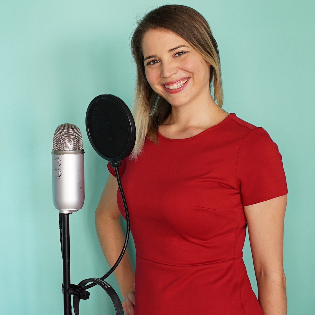
Use a photo of you that is high-res and close to your face like a head and shoulders shot. Podcast artwork is tiny, so make it easy for people to recognize your face!
It’s also important to use a high quality, high resolution photo to start with, since your podcast artwork should be 3000px by 3000px. The lower resolution your photo, the worse it will look when it’s blown up to this large size.
Don’t:
Use pictures or graphics that aren’t related to the topic you’re covering with your podcast. Make it easy for people to recognize the content visually. If you need help with this, hire an illustrator like @leighyoungart to create an on-brand image for you!
Do:
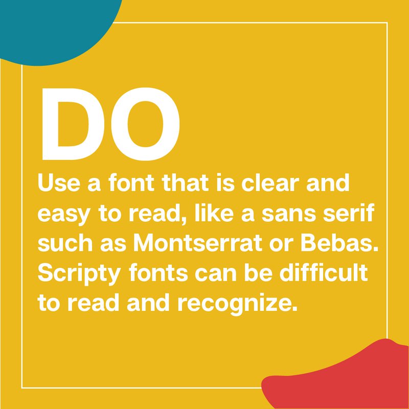
Use a font that is clear and easy to read, like a sans serif such as Montserrat or Bebas. Scripty fonts can be difficult to read and recognize – although if it’s in your actual logo you can keep it there!
Also be careful to use colours with a high enough contrast. Everyone has a different capacity to see colour and some have low vision, so a higher contrast will ensure more people are able to actually read the text.
Don’t:
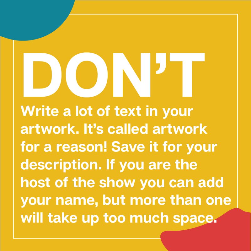
Write a lot of text in your artwork. It’s called artwork for a reason! Save the text for your description. If you are the host of the show you can add your name, but more than one name will take up a biiiit too much space if ya ask me! And you are! So there’s my opionion!
If a tagline is a big part of your brand, use it sparingly. Remember, we want to catch people’s eyes with your artwork – the busier it is the less likely they will be to want to take a second look.
Remember: When it comes to podcast artwork, keep it clear, keep it simple and keep it high contrast.
Need some more help getting started with your podcast? Sign up for instant access to my mini course How To Start A Podcast!

